A rack of beige sweaters can make a soft autumn color palette look easier than it is. Some shades feel gentle and wearable; others seem to erase the face above them. The difference often lies in depth, temperature and the amount of contrast in the whole outfit. Start with a few real clothes and a clear comparison rather than treating every earthy color as an automatic match.
Start with muted warmth, then check the depth
Soft autumn usually describes a palette of softened colors with a warm leaning: sage, muted teal, mushroom, warm rose and earthy browns are common examples. Exact swatches vary between seasonal systems. Use those names as a direction, not a promise that every garment sold under them will behave the same way. One shop's sage may be almost gray; another's may be a sharp yellow-green.
Muted does not mean pale. A softened medium brown can have more depth than a pastel peach while still feeling quieter than a clear orange. If a very light beige makes you feel washed out, try a richer version before rejecting the whole palette. The problem may be too little separation between the garment and your face rather than too much warmth.
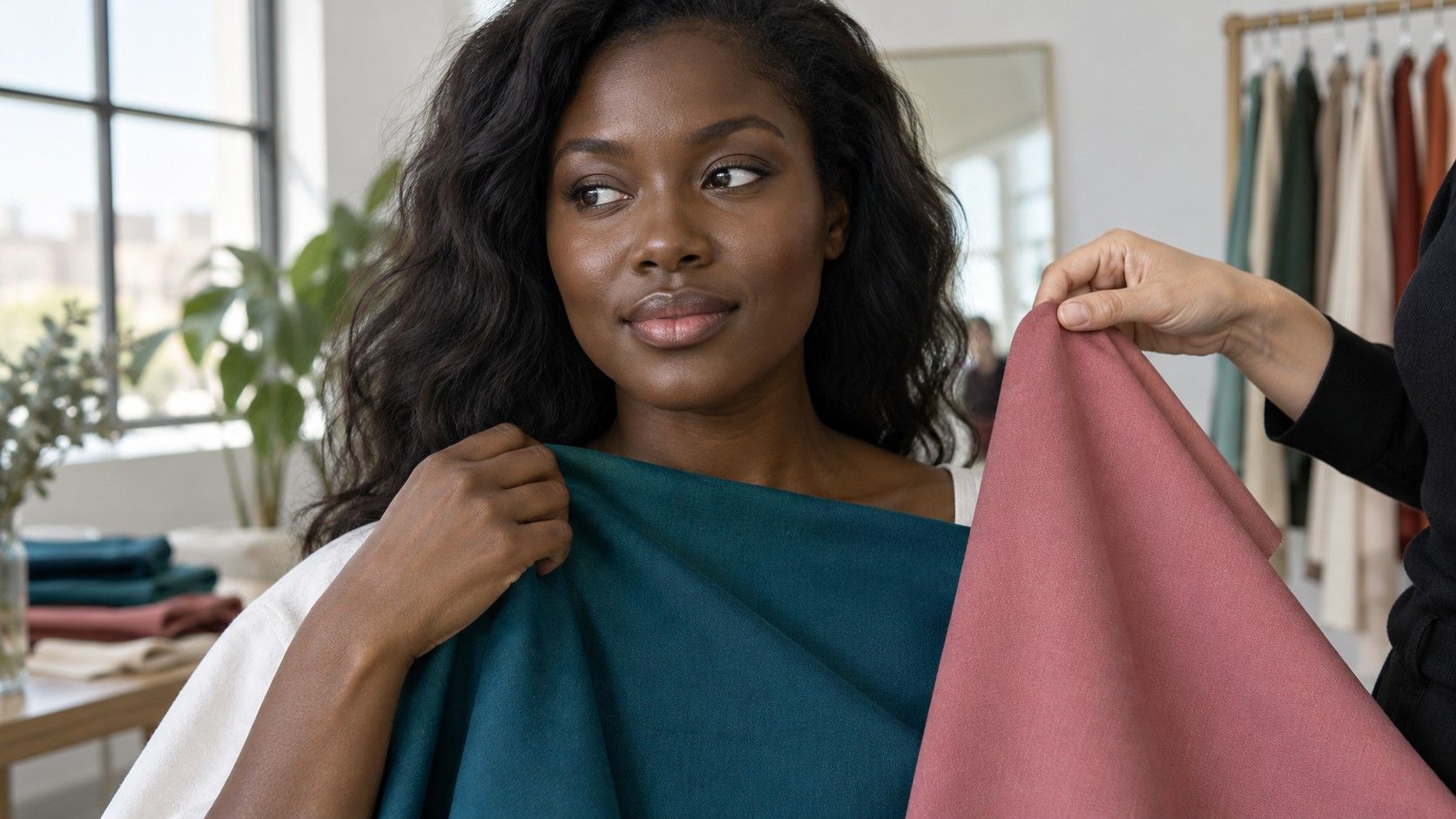
Compare a gentle rust with a clear orange at a similar depth, or a dusty olive with a clearer green. Hold the fabrics near your chin in steady, indirect daylight. Keep your hair, makeup and position the same. Ask whether you see your face first, whether the cloth feels disconnected and whether you prefer the effect without changing your usual routine.
Texture adds another variable. A brushed wool, washed linen or matte cotton can soften a color visually, whereas a smooth reflective surface may make a similar hue seem sharper. Compare similar fabrics at first. Later, use texture deliberately: a softened palette need not be a wardrobe of identical fuzzy knits, and a polished blouse can work with a quiet jacket.
Compare camel, taupe and brown before buying a neutral
Camel often appears on autumn shopping lists, but its range is broad. A golden camel, a pinkish tan and a gray-beige coat may all carry the same label. Put the actual fabric near your face and compare it with a familiar neutral. If the golden version seems too strong, a more balanced taupe may be easier; the palette name does not oblige you to choose camel.
Taupe can lean cool or warm. Look at it beside a gray cloth and then a brown cloth rather than trying to decide from a product photograph alone. A warm mushroom shade may bridge denim and a brown shoe particularly well. A cooler taupe may still work if you like the effect and it connects with other pieces you own.
Brown gives you room to add depth. Compare a medium cocoa with a very dark chocolate and a reddish chestnut. The darkest option might create more contrast than you want near your face, yet remain useful for trousers or boots. A medium brown jacket can make a pale top look more intentional by supplying a visible frame.
| If a neutral feels wrong | Try this comparison | Keep the test fair |
|---|---|---|
| Camel looks too yellow | A balanced mushroom or warm taupe | Use similar depth and fabric finish |
| Light beige disappears | A medium-depth oatmeal or cocoa | Keep the neckline shape the same |
| Dark brown feels heavy | A softened medium brown | Remove strong makeup changes from the comparison |
Do not choose a new neutral in isolation. Place it beside your existing coat, bag and shoes. A beautiful taupe that clashes with all three may create more shopping problems than it solves. Your first useful neutral is the one that looks convincing on you and joins several clothes already in circulation.
Build one small outfit combination
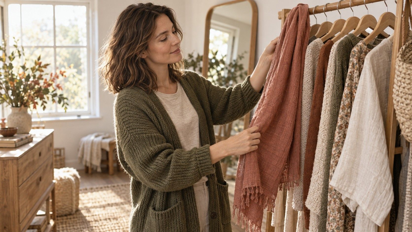
Begin with three pieces: a neutral bottom, a top and one layer. For example, try medium-brown trousers, a muted teal shirt and a mushroom cardigan. The purpose is to observe how the colors relate, not to reproduce a fixed formula. If the result feels flat, change one component rather than adding several accessories at once.
Keep some difference in depth. Three similarly pale pieces may blur together, especially when their textures are also alike. A deeper belt, darker trouser or more defined neckline can restore shape without introducing a very stark black-and-white contrast. Step back from the mirror and check the outfit from the distance at which someone would normally see you.
A tonal outfit can work well when the fabrics carry interest. Combine a smooth cotton shirt with a textured knit and a more structured trouser. That gives the eye something to read even when the color changes are subtle. If you prefer clean tailoring, use seam lines and fit to create definition instead of assuming softness requires loose or romantic clothing.
Test the combination through an ordinary day before buying duplicates. Does the cardigan work with your outerwear? Can the shirt also pair with jeans? Does the trouser need a shoe you do not own? These questions turn a color experiment into a usable wardrobe. Photograph the combination if helpful, but make the final judgment in person as well.
Keep an outfit note with the actual garment names, such as teal cotton shirt plus cocoa trousers, rather than only a digital swatch. If one part is unsuccessful, the note helps you identify what to replace. A palette becomes practical when it reduces the number of decisions required on a busy morning.
Choose an accent that still lets your face lead
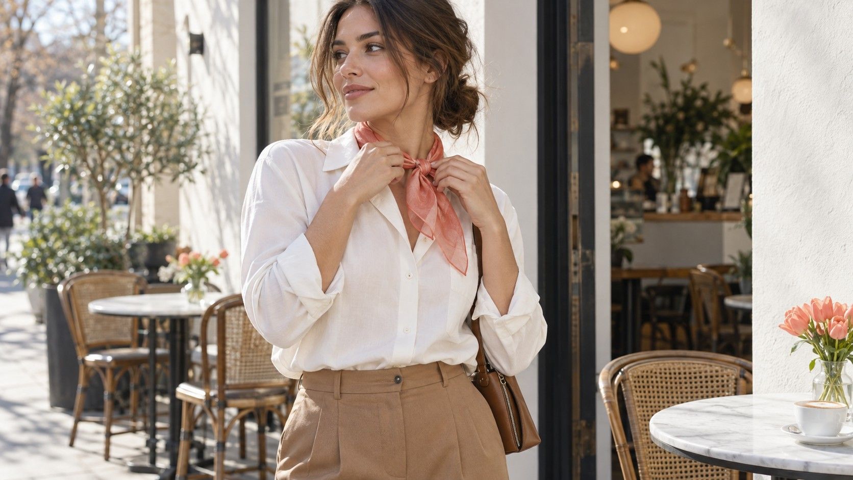
Muted rose, soft terracotta, sage and softened blue-green are useful candidates to compare. They are starting points, not compulsory colors. Choose two that appeal to you and hold them close to your face under the same light. A scarf or borrowed shirt is enough; there is no need to buy a selection merely to perform the comparison.
Pay attention to scale. A terracotta scarf fills much more of the area around your face than a small pendant or a narrow collar. If you like the hue but find a full top overwhelming, try less of it. Conversely, a tiny accessory may be too small to tell you much about whether you enjoy the color as a neckline.
Makeup can change the relationship between your face and the garment. A sheer warm rose lip may sit comfortably beside muted teal, while a very opaque, high-contrast lip changes the balance. Compare clothes with the makeup you normally wear, then repeat without strong color cosmetics if you are trying to understand the fabric itself. Neither version has to become your only acceptable look.
Patterns need a broader view than their brightest detail. A floral may include one clear coral but read as soft overall because the coral occupies little space. Look at the background, the largest shapes and the contrast between them. If the print feels too busy, try a smaller-scale pattern or colors closer in depth before abandoning patterns altogether.
Keep favorite colors that sit outside the palette
A soft autumn suggestion is a styling tool, not an instruction to remove black, icy blue or a beloved bright red. Placement changes the effect. A favorite vivid color can appear in a bag, shoe or skirt, while a quieter top frames the face. You can also wear it prominently because you enjoy the stronger statement.
If black is central to your wardrobe, try it with a warm, softened scarf or an open jacket that breaks up the dark area near your face. Compare that with black worn alone. You may prefer the extra softness, or you may like the sharper version. Keep the observation specific to the outfit rather than turning it into a rule about every black garment.
Work uniforms and dress codes offer less flexibility. In that case, use fit, neckline, jewelry and any permitted layer to make the outfit comfortable. A small amount of contrast may be the most useful adjustment. There is no benefit in feeling that an unavoidable work shirt has invalidated a color analysis.
When a suggested shade repeatedly feels wrong in real fabric, leave it out. Seasonal categories contain broad ranges, and a screen result cannot settle every variation of depth, texture and personal taste. Keep the handful of neutrals and accents that make dependable combinations. Add the next color only when you can see exactly where it will fit.