A deep complexion does not come with a compulsory wardrobe of jewel tones, and it does not settle whether warm or cool colors will feel right. The useful question is more specific: which fabrics let your face remain clear and present when they sit directly below it? Comparing warmth, depth and brightness separately gives you something you can use in a fitting room, even when an online result keeps changing its seasonal label.
When a dark complexion gets assigned a season immediately
Skin depth describes how light or dark skin appears. Warmth describes a different visual quality, while saturation describes how vivid or muted a color looks. Seasonal systems combine these dimensions in different ways. A person with deep skin can therefore prefer muted fabrics, light colors, cool shades or warm shades; depth alone cannot choose among them.
The common shortcut is to see dark hair, dark eyes and dark skin, then assign a deep season before any fabric comparison. That skips the actual relationship between the face and the color. A dark burgundy may look settled beside one face and heavy beside another. A pale lilac may create attractive separation even though it is much lighter than the wearer. Neither result is a rule for everyone with a similar complexion.
Keep the distinction between harmony and preference visible. You might enjoy a sharp white shirt precisely because it makes a dramatic contrast. Someone else may want the quieter effect of soft cream. Skin color analysis can help describe those effects, but it cannot decide which one belongs in your personal style. Choose the effect you want before treating every strong contrast as a problem.
Set up light that preserves detail in the face
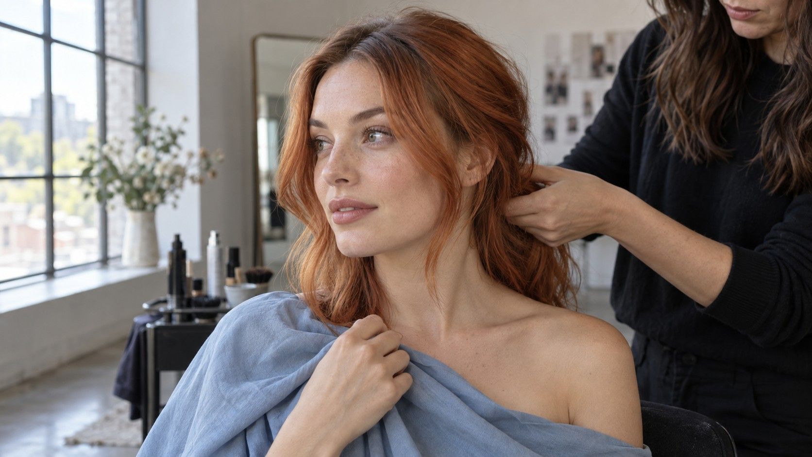
Face a window in indirect daylight and switch off nearby warm lamps. Avoid direct sun, which creates strong highlights and shadows, and avoid sitting with the window behind you. Use a plain, fairly neutral background. A bright green wall or red curtain can reflect color onto the face and turn a comparison into a test of the room.
If you take photographs, keep the camera, distance and crop unchanged. The face should show detail in both the lit cheek and the shaded side; a very dark exposure hides differences, while an overbright exposure can flatten them. Phone cameras may change exposure and white balance as each fabric enters the frame. If your camera offers reliable locks for those settings, use them. Otherwise, compare in a mirror first and treat photographs as supporting notes.
Remove tinted complexion products for the first round if that is comfortable, and keep jewelry away from the comparison area. Use the same plain covering over your shoulders each time you change fabric. Natural variations across the forehead, cheeks and jaw do not need to be corrected before testing. They are part of the face you dress, rather than evidence that the test has failed.
A white or gray card can help you notice that the camera has changed the entire scene, but an ordinary sheet of paper is not a calibrated reference. When both the card and your skin shift between frames, do not attribute the whole difference to the fabric. Repeat the pair with a smaller camera view of the clothing, or return to the mirror.
Compare warmth without changing everything else
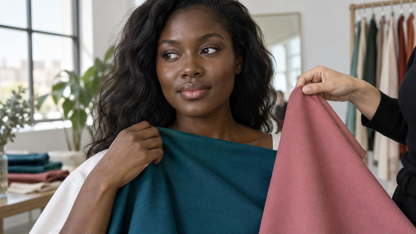
Choose two fabrics with roughly similar depth, saturation and finish. A warm brick red and a cooler raspberry can be a useful starting pair if neither is much darker or brighter than the other. Comparing pale peach with dark electric blue tells you very little about warmth because lightness and intensity change at the same time.
Hold each fabric at the same height below the chin, covering a similar area. Look at the face before studying the color. Does one comparison leave the jaw easier to distinguish from the neck? Do the lips seem more defined, or does the fabric draw so much attention that you stop seeing the expression? These are appearance judgments, so record what you actually notice rather than calling one side objectively correct.
Repeat the exercise with a different family, such as warm camel against a similarly deep cool taupe, or yellow-leaning green against blue-leaning green. Fabric names are loose descriptions, and two garments sold as taupe may be quite different. Check the physical pieces together before using their labels as evidence. A result that repeats across several reasonably matched pairs is more useful than a single winning scarf.
Do not use a gold-versus-silver jewelry test as the deciding vote. The metal's shine, surface texture and size can affect the comparison, and many people like both. Vein color is equally easy to misread under changing light. Those observations can start a question; fabric near the face is the more relevant test when the decision is about clothes.
Separate vividness from the depth of a color
Once warmth has a tentative direction, compare a clear color with a muted version at a similar depth. Try vivid teal beside a grayer teal, or a clean plum beside a smokier plum. A muted color contains less apparent intensity; it does not necessarily have to be light, beige or dull. Deep skin and soft saturation can make a convincing combination.
Then run a separate light-to-dark comparison within a similar color family. Hold a lighter blue, medium blue and deep navy near the face. The lighter fabric may bring welcome contrast; the darkest may feel composed, or it may look weighty beside your features. Keep the result separate from the saturation comparison so that “dark worked” does not quietly become “dark and bright always work.”
| Question | Useful comparison | What to keep steady |
|---|---|---|
| Warm or cool? | Brick red and raspberry of similar intensity | Depth, finish and area of fabric |
| Clear or muted? | Vivid teal and grayed teal | Approximate hue and lightness |
| Light or deep? | Lighter blue, medium blue and navy | Similar temperature and finish |
| Quiet or dramatic? | One-tone outfit and a light-dark pairing | The same neckline and setting |
Texture matters here. Glossy satin can throw bright reflections toward the face, while matte cotton looks more restrained in the same nominal color. Start with similar finishes, then test the fabrics you actually wear. A palette that looks convincing on flat digital squares may need adjustment for a shiny blouse or a thick, light-scattering knit.
Turn the observations into outfits you can repeat
Write a short description before choosing a season: “medium to deep, slightly cool, some brightness” is actionable even when two systems disagree about the name. Add two reliable neutrals and three accents you already own. Try them in full outfits rather than purchasing a complete palette. The area occupied by each color changes the result: a bright collar and a bright coat do very different jobs.
For example, if vivid green looks lively but feels overpowering as a sweater, use it in earrings or a narrow layer above a familiar navy top. If black seems too heavy at the neckline, an open collar, a lighter inner layer or a textured fabric can change the effect. You can keep a useful garment while altering the frame it creates around your face.
For online skin tone analysis, submit a well-lit, unfiltered image and note the conditions. If the result changes after moving rooms, do not buy clothes to satisfy each new output. Repeat a few physical comparisons and retain the observations that remain stable. A seasonal label is a filing aid; the evidence is whether those colors work in the mirror and in the places you wear them.
Bring two reference garments when shopping, or photograph them together in balanced light for a rough reminder. Compare candidates beside them and near your face. Shop lighting can make a cool gray look green or a soft red look unusually bright, so reserve judgment until you see the item under ordinary daylight. A return option is more useful than confidence based on a tiny screen swatch.