An online result can make a confusing wardrobe feel suddenly manageable: a season name, a row of colors, perhaps a recommendation to avoid black. The useful question is how much weight that result deserves before you buy clothes or change your hair. Online color analysis is best approached as a proposal to test. A repeatable preference for certain fabrics matters more than a confident label attached to one photograph.
Why a confident result can still change
A photo assessment starts with a representation of your face. Window light, a warm lamp, camera processing and nearby walls can all change that representation. A cream wall may reflect warmth into the shadows; a phone may brighten a face against a dark background. The software receives those pixels without necessarily knowing which colors came from your skin and which came from the room.
There is also a difference between consistency and accuracy. Uploading the same photograph three times and receiving the same season shows that the process is repeatable for that image. It does not establish that the image represents you faithfully or that the palette will work in your wardrobe. Even a stable classification needs a practical check with clothing near your face.
Seasonal systems are styling frameworks rather than a single universal measurement standard. Different systems divide warm, cool, light, deep, clear and muted qualities in different ways. Two assessments can recommend similar colors while giving them different names. A change from one season label to a neighboring label may be less important than agreement that medium-depth, softened colors are easier to wear.
Be cautious about percentages unless the service explains what they measure. A confidence score may describe an internal model decision, not the chance that a human stylist would agree. Without a defined test population and a clear standard for a correct answer, a precise number should not become a promise.
Run a controlled comparison before uploading again
Choose one simple setup and keep it. Face a window with indirect daylight, switch off room lamps and step away from strongly colored walls or curtains. Avoid a beam of direct sun across half the face. Use the same camera, distance and background, with the lens near eye level. A plain neutral top helps keep a vivid neckline from dominating the photograph.
Remove color cosmetics for the comparison if practical, particularly foundation, bronzer and strongly colored lipstick. Keep your expression relaxed and avoid beauty filters. If your hair is dyed a strong shade, take one photograph with it visible and another with it covered by a neutral cloth. Record that change so you can separate the effect of hair from the effect of a different room.
Make two or three photographs in that setup, then repeat on another day under comparable daylight. You do not need twenty uploads. The point is to see whether small, realistic changes cause large swings. Keep the original files; screenshots and social-media copies can introduce further processing. Follow the service's framing instructions, but do not alter your skin color to make the picture look more flattering.
| Comparison | What it can tell you | What it cannot establish |
|---|---|---|
| Same file uploaded again | Whether that input gets a stable output | Whether the photo or season is correct |
| New photo in the same setup | How sensitive the result is to small capture changes | How clothes look in person |
| Real fabrics in steady light | Which tested colors you prefer near your face | That every shade in a season will suit you |
If the result changes, note the actual recommendation as well as the label. A shift between cool and warm is worth investigating. A shift between two soft palettes may still leave you with a useful common set of colors. Repeated uploads become unhelpful when you keep changing conditions until the software returns the season you hoped to receive.
Compare real fabric near your face
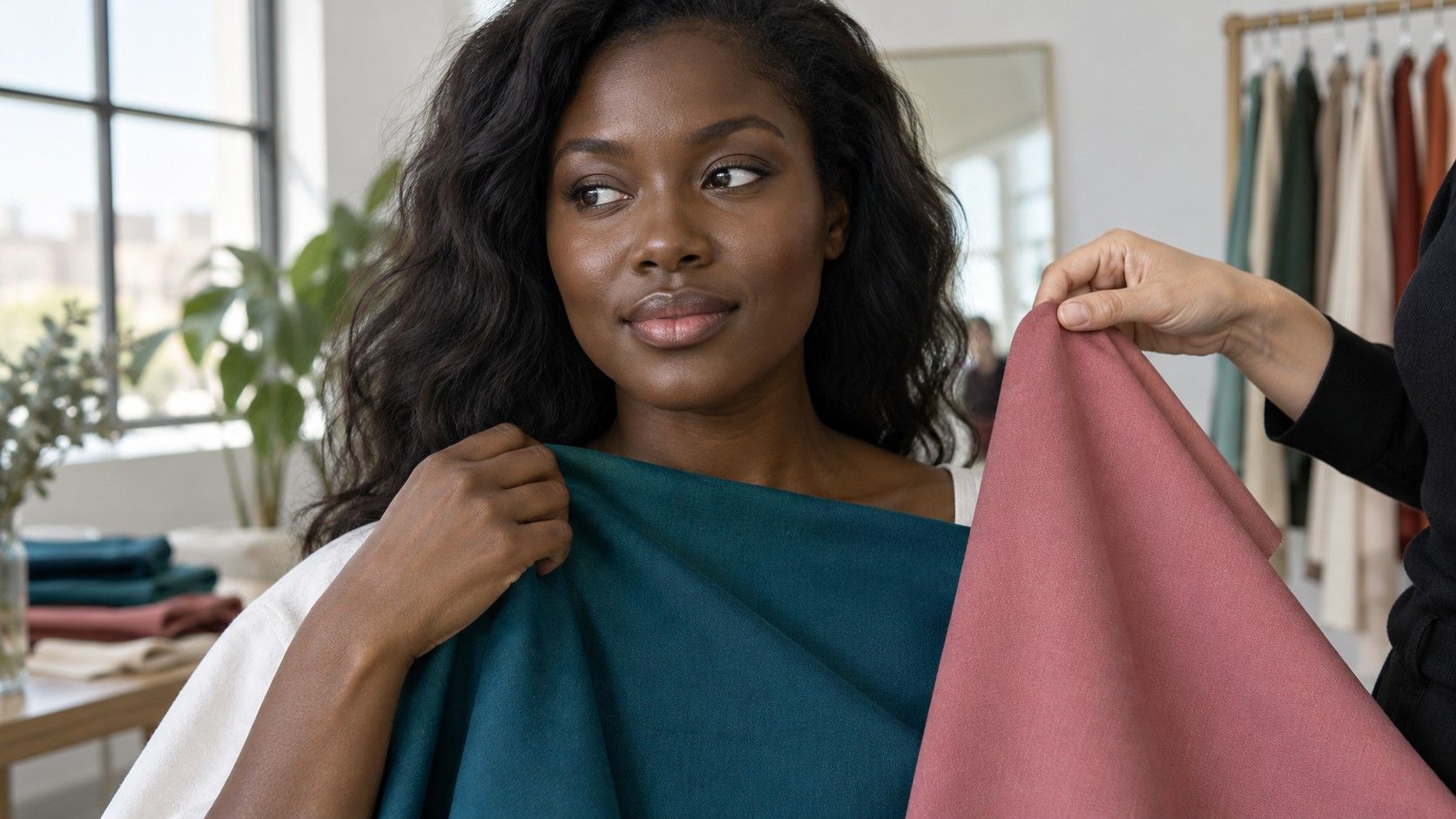
Gather clothes you already own, borrowed scarves or fabric offcuts. Start with pairs that differ mainly in one quality: a warm coral and a cool rose of similar depth, a muted blue and a clearer blue, or a light gray and a deeper gray. Comparing pale peach with dark navy mixes temperature, depth and contrast, making it harder to understand your preference.
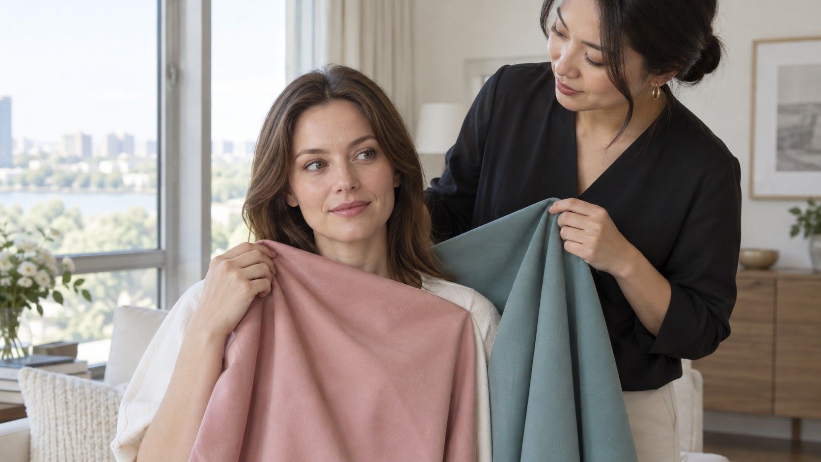
Hold each fabric below your chin with your hair and position unchanged. Look at your whole face before staring at individual skin marks. Does one option make the fabric seem to arrive before you do? Does another leave your features looking distinct without requiring stronger makeup? These are visual judgments, so give yourself permission to record a close call rather than declaring a winner.
Change fabrics back and forth a few times, then move away from the mirror. Returning after a short break can expose a preference caused by familiarity. If another person helps, ask what they see before revealing the app's recommendation. A neutral question such as which color looks more balanced is more useful than asking whether they agree that you are a particular season.
Fabric finish matters. A shiny satin reflects light differently from a brushed knit, and a white shirt with a glossy surface may feel sharper than an ivory sweater for reasons beyond hue. Use similar textures when possible. When that is impossible, write down the limitation instead of treating a single comparison as proof of an undertone.
Use the result where it earns its place
A useful palette makes a specific decision easier. Perhaps dusty blue, soft white and charcoal work together in several outfits, while the brighter alternatives sit unworn. That is actionable even if the exact seasonal name remains uncertain. Begin with two or three colors you can test repeatedly, rather than replacing every neutral in the closet.
Pay particular attention to garments close to your face: shirts, scarves, jackets and spectacle frames. Shoes and trousers can carry colors you enjoy without the same immediate framing effect. If an otherwise successful outfit includes a color outside the suggested palette, its placement, texture and pairing may explain why it works. There is no practical reason to discard it just to keep a chart tidy.
Try one recommended color in several ordinary situations. Wear it beside your existing coat, look at it in a mirror at home and check whether it works with the lipstick or glasses you actually use. A palette that looks coherent on a screen but demands an entirely different routine may be a poor fit for your personal style.
For a purchase, choose an item you can compare with something familiar, preferably with a return option. Keep the tags attached during the comparison. A good outcome is fewer uncertain decisions and more wearable combinations; it does not require every person to describe your appearance using the same season.
Know when a second assessment is worth the effort
Seek another view when controlled photos repeatedly move between very different recommendations, or when the proposed colors consistently feel less convincing than alternatives in real fabric. First check the capture conditions. Paying for a second assessment using the same heavily processed photograph may repeat the original problem rather than resolve it.
If you consult an analyst, ask how they handle uncertainty, dyed hair and people whose coloring does not match the examples in their materials. Ask whether the assessment includes live fabric comparisons or relies entirely on uploaded images. A useful explanation should identify the observed differences and leave room for neighboring palettes, rather than attributing everything to eye color or a vein test.
AI color analysis may provide a low-effort starting point, especially when it suggests colors you had overlooked. It offers less support for expensive, hard-to-reverse decisions. Before a major hair change, for example, discuss the desired shade with a qualified colorist and use strand testing where appropriate; a season label cannot predict the whole result.
Keep a short record of what survived testing: the photo setup, recurring recommendations, fabrics you preferred and questions that remain open. Three dependable colors are more useful than a folder full of contradictory badges. Let the wardrobe evidence carry more weight as it accumulates.