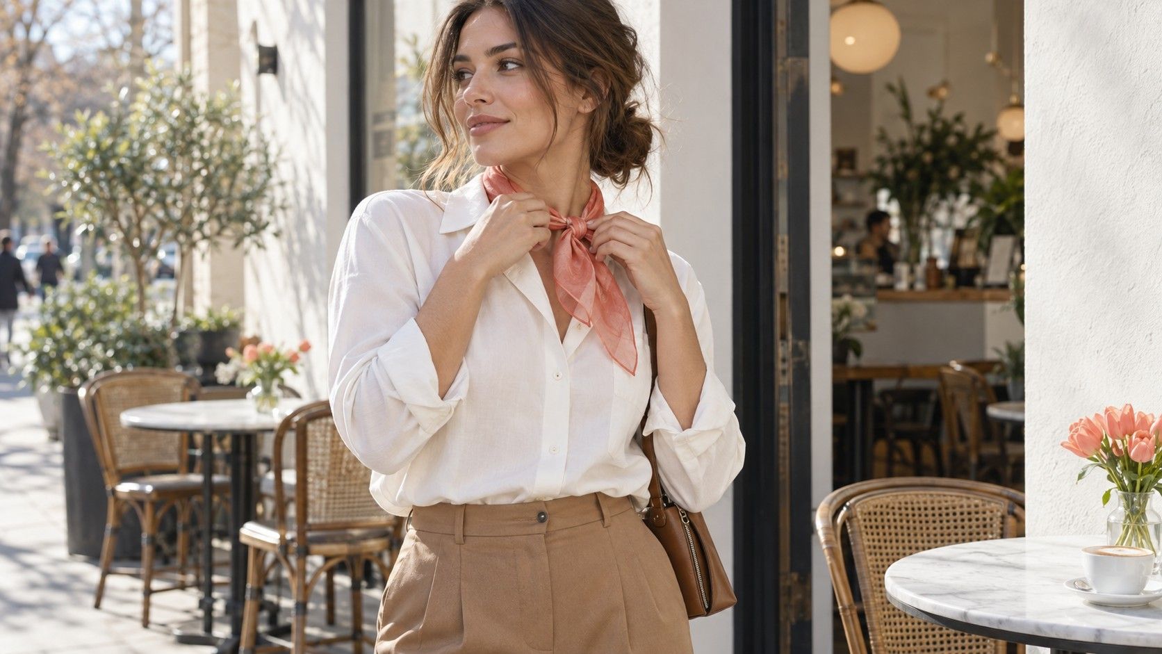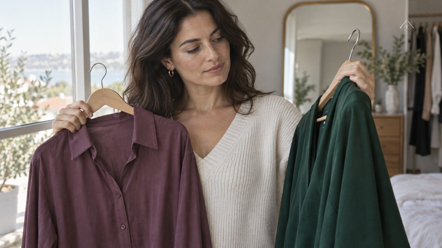
Olive is a useful description until it becomes a shopping rule. One chart suggests earthy colors, another recommends jewel tones, and a beige top can still look disappointing beside the face. An olive skin tone color palette is easier to build by comparing the properties of actual fabrics: how clear they are, how light or dark they are, and whether their warm or cool character works in your everyday lighting.
Observe olive coloring in neutral light
People use “olive” to describe a greenish, grayish or muted impression in the complexion, often alongside other tones. It does not identify one skin depth, ethnicity or seasonal group. A light complexion and a deep complexion can both be described as olive. The word also cannot settle whether every warm or every cool garment will suit you.
Begin near a window in indirect daylight. Turn off a warm lamp beside the mirror and avoid standing against a vividly colored wall. Light reflected from a green curtain or a red shirt can affect what you see. Use a quiet background and pull a bright neckline away from the face before judging the complexion itself.
Check your face, neck and visible chest together. Foundation, a recent tan or surface redness can make one area appear different from another. For a first comparison, use little or no color makeup if practical. Later, repeat with your usual makeup, since that is the combination your clothes will accompany on an ordinary day.
Skin tone analysis for styling is a visual exercise, not a diagnosis. There is no need to prove the olive label before testing a shirt. If you cannot confidently name your undertone, record the colors that work in repeated comparisons and leave the label open. The wardrobe decision can be clear even when the terminology is not.
Compare clear and muted fabric
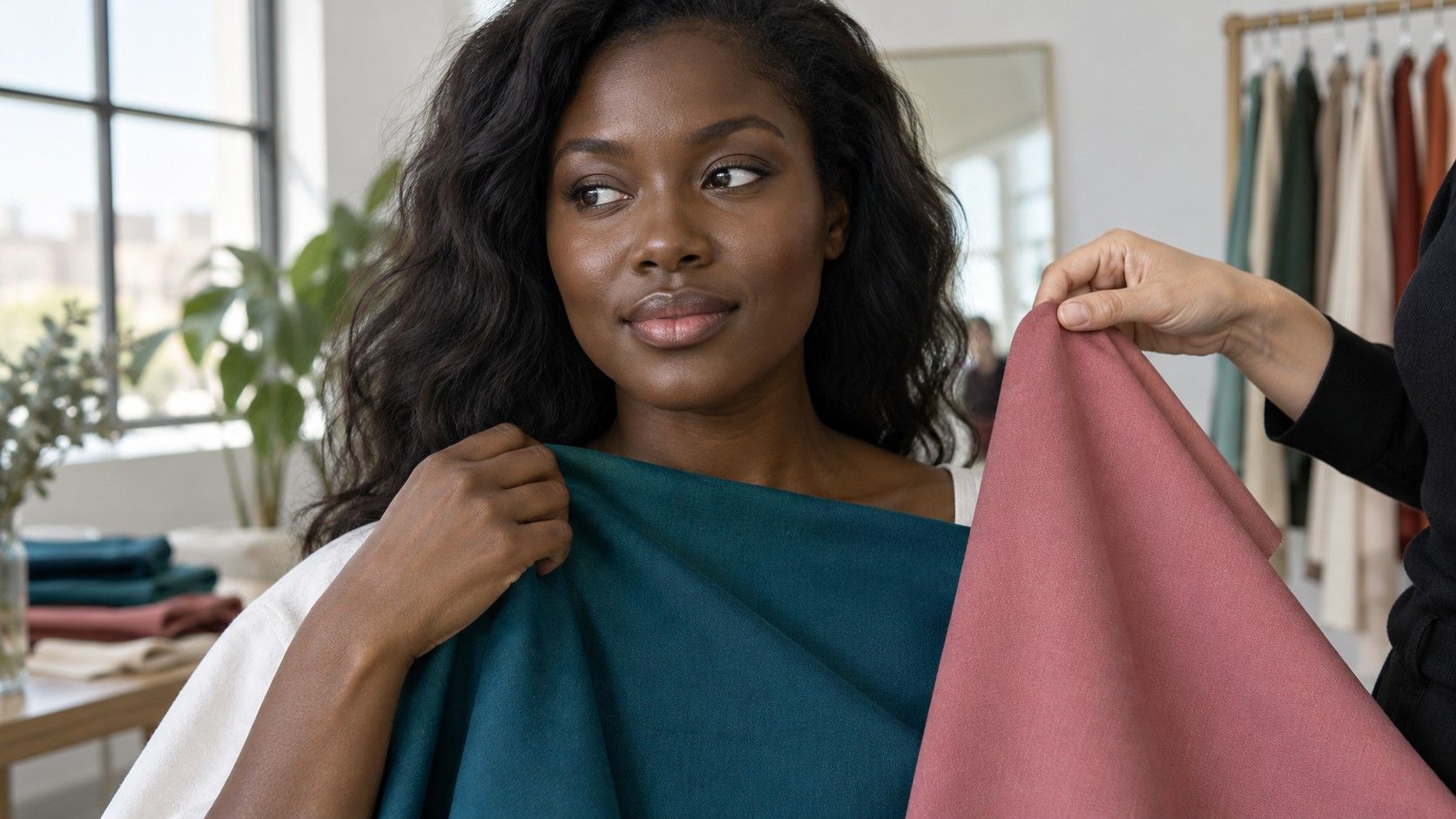
Saturation describes how strong or softened a color appears. A clear teal and a smoky teal may share a broad hue while creating different effects near the face. Choose a pair with roughly similar depth so the comparison focuses on clarity. A pale dusty green against a dark emerald mixes depth and saturation, making the result harder to interpret.
Hold one fabric below the chin, then swap it for the other. Cover the neckline of your existing top and use a similar amount of fabric each time. Look at the face before inspecting the shirt. Do you notice a coherent overall impression, or does the garment become the only thing you see? Either can be a deliberate style choice, but they serve different purposes.
Try another hue before drawing a rule. If smoky teal seems too dull, compare a softened raspberry against a clearer berry. You may dislike a particular gray-green without disliking muted colors as a group. Likewise, one successful bright blue does not establish that every highly saturated orange, pink and yellow will be equally easy to wear.
Keep texture reasonably consistent. Glossy satin catches highlights, while brushed wool can make a similar color appear softer. A shirt with a tiny white print may look less saturated from a distance than the same hue in a solid fabric. If you like a color in one material but not another, save that distinction instead of forcing both into a single verdict.
Check depth independently
Value is the lightness or darkness of a color. Test it separately with a family of neutrals: a light gray, medium gray and charcoal, for example. Then repeat with a color you like, such as pale blue, medium blue and navy. This shows whether your preference is consistent or depends on the hue.
A deep complexion does not require every outfit to be dark, and a light complexion does not require pale clothing. Contrast between hair, skin, brows, eyes and clothes contributes to the result. A light shirt with dark trousers can create a strong outfit even when the color beside the face is gentle. The whole arrangement matters.
Notice the neckline as you compare. A charcoal turtleneck surrounds more of the face than a charcoal cardigan worn open over a lighter shirt. If the dark fabric feels heavy, reduce its area before abandoning the color. A visible strip of another color can change the balance without requiring a new jacket.
Take a few steps back from the mirror. A close view encourages attention to small skin details, while a normal viewing distance shows the relationship between face and clothing. Test the same outfit seated if it is for work or video calls. A dark jacket may look balanced full length but dominate a tightly cropped screen view.
Choose neutrals without undertone shortcuts
Beige is not one color. Some versions lean yellow, others pink, gray or brown. “Nude” is equally imprecise and depends on the person and purpose. Bring the exact fabric to your face rather than assuming a neutral will disappear harmoniously because it has a familiar name.
Compare cream with a softer white, camel with taupe, and warm brown with a cooler brown. Choose pairs of comparable depth where possible. You may prefer cream over stark white yet prefer cool brown over camel. That mixed result is usable information; it does not need to be corrected to fit a warm-cool shortcut.
For olive coloring, a close skin-colored beige may sometimes feel flat because there is little separation between garment and face. Try more difference in depth, a clearer color at the neckline, or a small contrasting detail. If the beige itself is useful for trousers, keep it there and choose a different shirt. A difficult face-framing color can still earn its place elsewhere.
Black also needs an ordinary clothing test. Compare it with charcoal, ink navy and a deep brown you already own. Look with your usual hairstyle, glasses and makeup rather than judging a disembodied fabric swatch. If black suits your style but feels stark, an open neckline or a softer layer can change how much contrast reaches the face.
Build a repeatable palette test
Set aside six to eight garments rather than emptying the entire wardrobe. Include a few reliable pieces and a few doubtful ones. Choose one pair for saturation, one for depth and one for warmth. Give the comparisons ten quiet minutes in steady light, then stop if the differences become difficult to see. Staring longer does not always make a subtle choice clearer.
Write specific notes. “Medium-depth teal, clearer rather than gray” helps more than “green works.” “Taupe trousers useful, but prefer navy near face” explains where a neutral belongs. Add the material and finish if they mattered. These descriptions translate better to a shop rack than a single season name.
If you photograph the tests, keep position and camera settings consistent and turn off filters. Check whether the background or whites change between pictures; that can signal automatic exposure or white-balance adjustments. Use the mirror as the main comparison and the images as a record, especially when deciding between subtle undertones.
Repeat the strongest preferences on another day in similar light. A color that works consistently deserves a place in the starting palette. A pair that remains difficult can stay undecided. There is no requirement to rank every shade, and small differences may have little practical effect once clothing, accessories and movement are involved.
Build three wearable combinations with what you own: a dependable neutral and a favorite color, two neutrals at different depths, and one more expressive contrast. Wear them in the rooms where you spend time. Warm indoor light may change your impression of a gray or beige, so the final choice should survive normal life beyond the window test.
Use new purchases to fill a demonstrated gap. If medium navy repeatedly works but you have no suitable work top, that is a concrete need. Buying every color listed on an olive palette chart creates a collection of swatches rather than a wardrobe. Keep the palette small enough to recognize, and widen it when a new comparison gives you a reason.