A close photograph of an iris can look persuasive: a gold ring, a slate edge, a few green flecks. It is tempting to turn those details into a season and start shopping. Eye color analysis becomes more useful when you step back. The important question is how a color works beside your whole face at a normal distance, with your eyes open and your usual expression.
Why eye color is only one clue
Seasonal color analysis groups clothing colors by qualities such as warmth, coolness, lightness, depth and clarity. Different systems draw the boundaries differently. Eye color contributes to the overall impression, but an eye label cannot tell you which group of fabrics will suit you best. Brown, blue, green and hazel each cover a wide range of appearances.
Two people with brown eyes may look quite different in the same camel sweater. One may prefer its golden quality; the other may find a cooler brown easier to wear. Their hair, skin appearance and the contrast between features change the comparison. Even an exact description of both irises would leave much of that picture out.
Think of the eye as a small part of a larger composition. From across a table, the dark edge around an iris may register more strongly than tiny golden flecks near the pupil. A useful palette needs to work at that distance too. If a theory fits an enlarged eye photograph but fails beside your face in a mirror, the fabric comparison deserves more weight.
Separate iris color from reflections
Start with a clear view in soft daylight, away from direct sun. Face a window without leaning so close that one side of the face becomes much brighter. Turn off nearby colored lamps. A green wall, a bright red top or a warm bedside bulb can change the light reaching your face and the impression captured by a camera.
Use an ordinary photograph without a beauty filter or a color effect. Keep the camera far enough away to include the whole face, rather than trying to fill the frame with one eye. You can crop a copy to inspect details later. A close view is useful for description, but it should not replace the original image.
Look at the same eye in two or three photographs taken in comparable daylight. If the iris appears amber in one, gray in another and green in a third, inspect the lighting and processing before deciding it has changed category. Phone cameras adjust exposure and white balance automatically; their version of a subtle color is an interpretation.
For clothing tests, remove colored contact lenses or note clearly that you are testing a deliberate eye-color change. Clear glasses can still produce reflections, so check a view without the frames if that is comfortable. There is no reason to shine a torch into your eyes, use a flash at close range or strain to capture a perfect iris image. Ordinary viewing conditions are enough for a style decision.
Compare the whole face before choosing a season
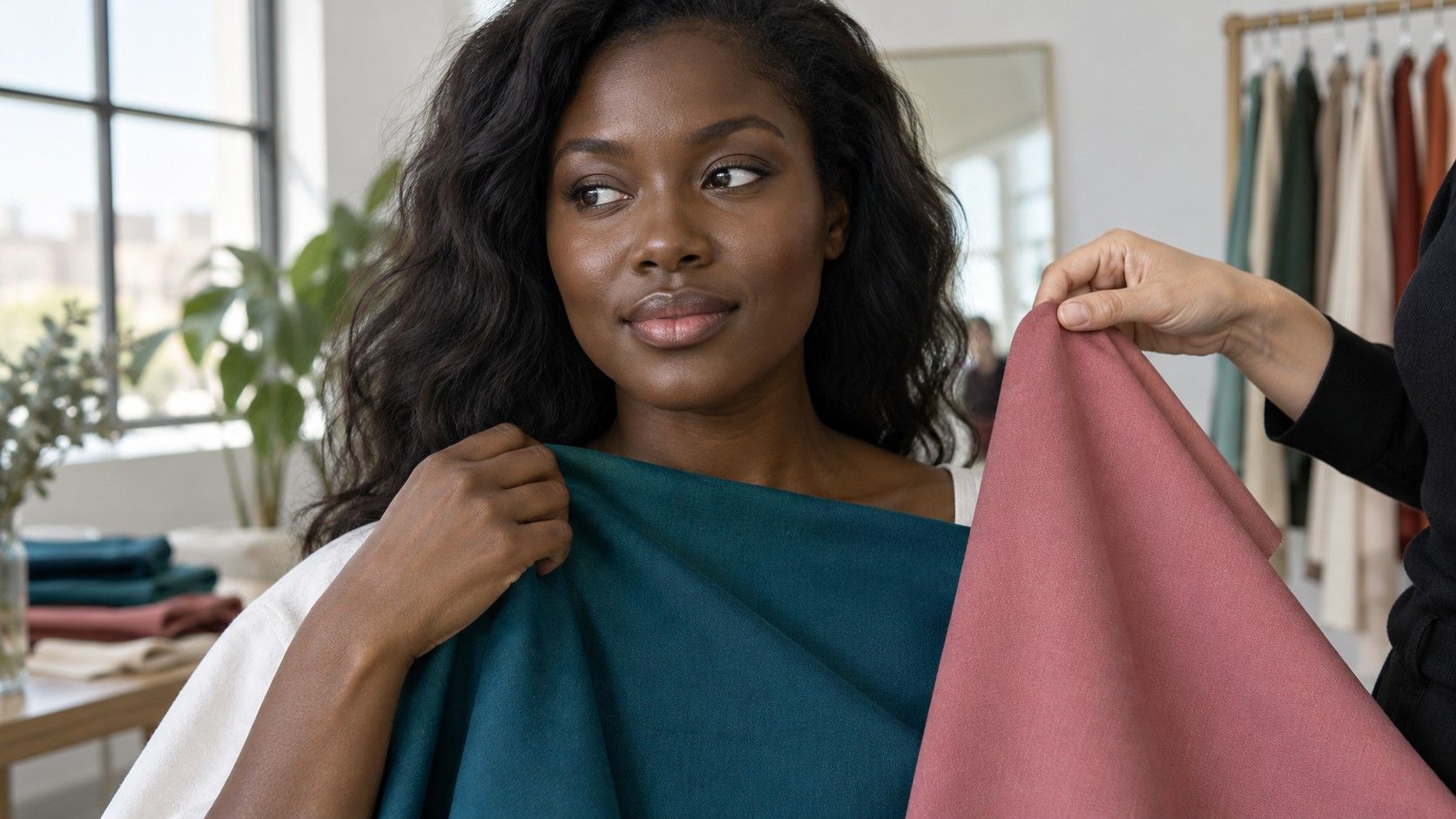
Use fabric you already own: shirts, scarves or a clean pillowcase. Hold each piece just below the chin, covering the top you are wearing. Keep the distance to the mirror and the lighting unchanged. Choose two reasonably similar fabrics when possible. A shiny satin scarf and a matte wool sweater can produce a confusing comparison because their surfaces handle light differently.
First compare colors with similar depth, such as a muted warm rose and a muted cool rose. Next compare a soft blue with a clearer blue, or medium gray with charcoal. You are changing one quality at a time. Comparing pale peach against black mixes temperature, depth and saturation, which makes it hard to tell what caused your preference.
Notice whether attention moves naturally between your eyes and the rest of your face. A fabric may make the iris appear vivid yet dominate the cheeks and mouth. Another may look less dramatic but make the whole face feel more balanced. Neither observation is a measurement of health or an objective score of attractiveness; they describe a visual preference under those conditions.
Photograph each comparison with the camera fixed and the same neutral background. If the phone visibly brightens one image, do not treat that as evidence that the fabric improved your coloring. Compare in the mirror as well. Ask a friend a neutral question such as “Which one draws your attention to my face?” rather than announcing which season you expect to be.
Avoid season rules based on eye color
Rules such as “blue eyes mean Summer” or “gold flecks mean Autumn” are too narrow to choose a wardrobe. They skip the actual effect of the colors. A person can have light eyes and strong overall contrast, or dark eyes and a softer appearance. Hair dye, makeup, glasses and the lighting in a reference picture can further change the impression.
Vein checks and a quick gold-versus-silver jewelry test can also be ambiguous. Jewelry differs in brightness, finish, size and placement. A large polished gold earring compared with a tiny brushed silver stud does not isolate warmth. If you enjoy both, that is a useful wardrobe preference rather than a problem that needs resolving into one metal.
Be especially cautious with charts that assign a season from an iris pattern. A ring, spoke or fleck may help you describe what you see, but a chart cannot show how an actual shirt looks against your skin. There is no need to find a special pattern before you can compare clothes. If your eyes look mostly uniform, use the same fabric method.
When two seasonal labels remain plausible, keep the overlap as a working palette. If muted teal, soft navy and rose brown work well in repeated comparisons, wear them while you test a few boundary colors. Buying a full wardrobe to settle a label reverses the useful order of decisions.
Use eye color in clothing choices
Repeating part of your eye color is a simple way to coordinate an outfit. Blue eyes might be echoed by denim, hazel by an olive scarf, and brown by a cocoa knit. The match does not have to be literal. A slightly grayer or deeper version may be easier to combine with your existing clothes than a precise digital sample from the iris.
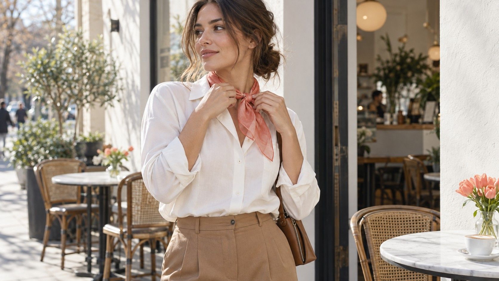
Place the echo where it matters. An open collar, a scarf or an earring sits near the face; trousers make a quieter connection. If a strong green brings out a hazel iris but feels overpowering as a whole shirt, use a narrow stripe or a small accessory. You can keep the color relationship and reduce its area.
Contrast offers another option. A dark frame can give light eyes a stronger outline, while a softer frame may create a gentler overall effect. Test both with the clothes you wear most often. A frame that works beside a black jacket may feel quite different with a pale linen shirt, so judge the combination rather than the eye in isolation.
Try three outfits using the same base: one with an eye-color echo, one with a familiar neutral, and one with a different color you enjoy. Look at them in daylight and in the room where you will actually wear them. Make a short note about what worked: “soft teal near face,” “brown better as a small detail,” or “charcoal frame too strong with pale top.” These notes are more useful at a clothing rack than a complicated iris diagram.
Keep personal style in the decision. You may prefer an energetic contrast for an evening out and a quiet blend for work. Eye color can suggest a starting point for either choice. The result worth keeping is a repeatable combination that looks right to you, not an obligation to wear the color of your eyes every day.