The blue-green swatch that looked gentle on your phone seems almost electric on a laptop. In the store, the closest shirt looks different again. That does not automatically make your palette useless. A digital color is being displayed by a light-emitting screen, while a garment reflects the light around it. Use the palette to describe the relationships you want, then let real fabric make the final case.
A digital swatch is not a fabric sample
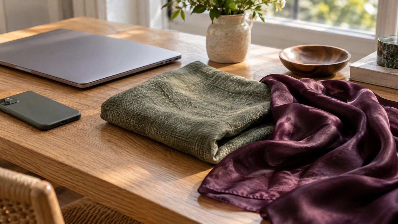
A screen creates its colors with light. A shirt is visible because light reaches its surface and is reflected toward your eyes. The shirt's dye, weave, finish and surrounding illumination all contribute to its appearance. Even a carefully displayed swatch cannot show the full effect of a matte cotton, glossy satin or textured wool in motion.
Product names add another source of confusion. Teal, dusty rose and warm beige are broad descriptions, not exact specifications shared by every retailer. Two garments called sage can differ in warmth and depth. If you find a shirt that appears close to your palette, inspect it beside your face and existing clothes rather than deciding from its name alone.
A saved image also carries assumptions about how it should be displayed. Different software and devices may handle those assumptions differently, while the physical capabilities of the displays vary. You do not need to diagnose every technical detail to shop sensibly. First establish whether the disagreement is large enough to alter your choice: a slightly different blue is less consequential than a muted blue appearing sharply vivid.
Keep color palette analysis separate from exact product matching. A useful result may tell you that softened medium-depth colors are easier to combine, or that you enjoy clear accents against dark neutrals. Those relationships can survive a modest display difference. They are more dependable shopping instructions than trying to reproduce one tiny rectangle exactly.
Check the settings that change your view
Begin with visible settings. A warm evening mode, blue-light reduction setting or adaptive color feature can shift the white point of a display. A vivid picture mode may make colors appear stronger. The names differ across devices, so look for controls that change color temperature, saturation or the display's response to ambient light.
For a short comparison, use a consistent standard mode where available and temporarily disable obvious color-shifting features. Note what you changed so you can restore your everyday preferences afterward. This does not calibrate the display, and it does not make the phone an objective color instrument. It simply removes some avoidable variation.
Brightness matters too. A very bright phone in a dim room can make a palette feel more luminous than the same image on a moderate-brightness laptop. Choose a comfortable, stable setting and avoid direct sunlight reflecting from the glass. If automatic brightness keeps changing during a comparison, hold the conditions steady or temporarily use a fixed level.
Look at a neutral area of the image as well as the colored swatches. If a white background appears strongly cream on one screen and bluish on the other, that gives context for the disagreement. Do not adjust the palette image itself to compensate. Editing the file creates a new version and makes later comparisons harder to interpret.
Color accessibility filters can intentionally alter the whole display. If you use them, retain the settings you need for comfortable access and recognize their effect when discussing a color with another person. A physical fabric comparison may be a better bridge than trying to make two differently configured screens agree.
Compare screens without chasing a perfect match
Open the same original file on both devices in the same room. Avoid comparing a downloaded image on one screen with a compressed screenshot on another if you can use the original in both places. Keep the viewing angle straightforward; some displays change noticeably when tilted, so a phone lying flat on a desk is an unfair comparison with a laptop facing you.
Start with the broad pattern. Which colors are lightest and deepest? Which look muted, and which look clear? Are two neighboring swatches still similar, or does one become unexpectedly warmer? You are trying to identify whether the palette's useful structure survives, rather than making every edge and highlight identical.
| Difference you see | First practical check | Useful response |
|---|---|---|
| Everything looks warmer on one device | Color temperature and evening settings | Compare after using a stable display mode |
| Colors look much stronger | Vivid mode and screen brightness | Judge muted versus clear relationships again |
| Only a tilted view looks wrong | Viewing angle and reflections | Place both displays at a direct viewing angle |
Choose one device as a consistent reference for ordinary use. That is a convenience decision, not proof that it is the most accurate. Save the original file there, keep its viewing setup reasonably steady and use the same verbal descriptions in your notes. Switching between screens until one agrees with a garment can create false reassurance.
If you require close color matching for professional production, a casual phone comparison is the wrong level of control. A managed display workflow and physical samples serve a different purpose from wardrobe exploration. For personal clothing choices, the sensible stopping point is usually an understandable palette and a real garment that works.
Take the palette shopping as a direction
Before leaving home, translate three or four swatches into plain language: a softened blue-green, a medium cool rose, a warm off-white and a deep brown. Add a familiar garment for reference if practical. Descriptions keep the task manageable when the store light and the phone disagree.
Find a small group of candidates and compare them with each other. One beige may look neutral until you put it beside a grayer beige; one blue may reveal a green lean beside another. Relative comparison is often easier than naming a single color in isolation. Keep depth and fabric finish reasonably similar when investigating temperature or clarity.
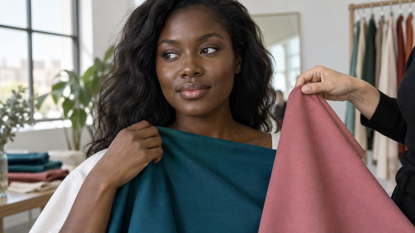
Hold the garment near your face, then check it with the coat or cardigan you will actually wear. Store lighting can differ from daylight, so move toward a neutral, naturally lit area if available and permitted. Do not assume that a flattering fitting-room mirror settles the question. For online shopping, assess the delivered item before removing tags and keep the return conditions in mind.
A physical swatch can provide a portable reference, but it is still a material under changing light. Printed paper, woven cloth and a shiny garment need not appear identical. Use a swatch to narrow the rack rather than to reject a good outfit because the hue misses a tiny sample by a fraction.
If you cannot find a close candidate, leave with a better description rather than a compromise purchase. Perhaps the available greens were all too yellow, or the blues were too pale. That observation makes the next search more focused and costs less than accumulating clothes that only resemble your palette on the shopping screen.
Use color relationships when an exact match is impossible
Build an outfit around depth, clarity and the amount of contrast. A medium muted green with a softened dark neutral may capture the relationship you liked even if neither item matches the original swatch. Check the outfit as a whole from a few steps away, not only as two small pieces of fabric held against the phone.
Keep your successful combinations documented with garment names and a short description. A photo can help you remember the arrangement, but it will be affected by capture and display conditions too. The note that a blue-green shirt works with cocoa trousers remains useful when a later phone makes the image look slightly cooler.
A color analysis app may let you collect favorite shades, but keep the original result separate from your own additions. That way you can distinguish what was recommended from what you discovered through wearing clothes. Both can be useful, and neither needs to be forced into a supposedly perfect screen match.
When a palette repeatedly looks attractive digitally but awkward in real clothing, test its central ideas again with fabric. You may prefer a little more depth, less saturation or a different neutral than the chart suggests. Keep the relationships that produce wearable outfits and revise the parts that fail outside the display.