A shirt that looks calm in the mirror can become the brightest object in a video meeting. Your camera is translating the whole room, and its decisions about exposure and color may change when you move or switch tops. Choosing a reliable call outfit starts with the actual webcam view, then works backward through lighting, background and fabric. A seasonal palette can supply ideas, but it cannot predict every camera's version of a color.
Start with the camera and room you actually use
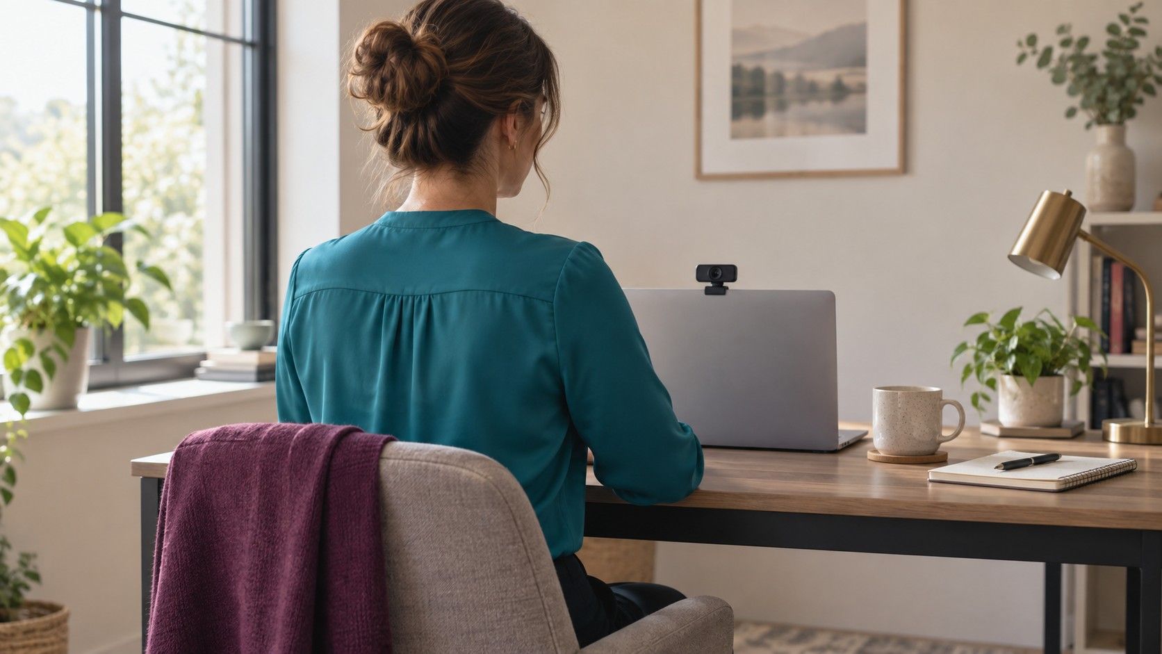
Open a preview in the meeting application you normally use, with your usual camera selected. A phone selfie taken by a window is a poor substitute for a laptop webcam across a room. Use your normal seat, desk height and screen brightness. Frame yourself as you expect to appear on the call, including enough of the neckline and shoulders to judge the color near your face.
Place the main light in front of you or slightly to one side, rather than directly behind your head. A window behind you may leave the face dark as the camera responds to the bright background. If you face a window, avoid direct sun and check whether passing clouds cause large changes. A stable indoor light may be easier for an evening meeting than trying to preserve a daylight setup after sunset.
Turn off unnecessary lights that give the scene competing color casts. Daylight from one side and a warm lamp from the other can create two different-looking halves of a face. A green wall close to the desk can also reflect color. Before blaming a shirt, try moving the lamp, changing your angle or creating a little distance from the wall.
Disable optional appearance filters for the first comparison. Background effects and face adjustments can change edges, skin appearance and apparent contrast. You can restore the settings you intend to use later, but a plain preview makes it easier to identify the source of a problem. Keep notes about the conditions so that the good result is something you can repeat.
Check whether the camera is changing the whole scene
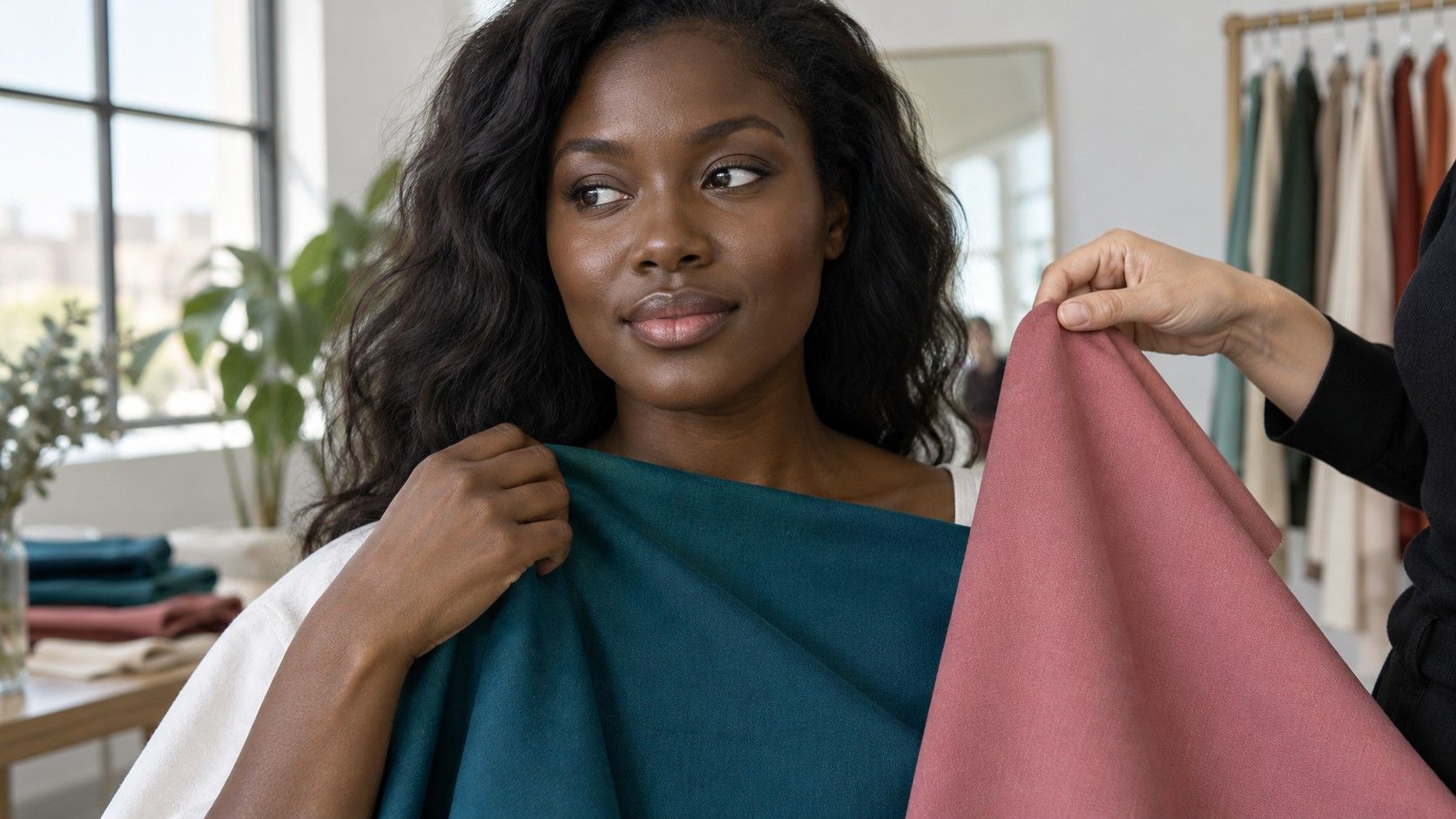
Hold a medium-blue top near the face, then replace it with a pale one. Watch the wall, hair and any neutral object in the frame as well as the skin. If everything becomes darker or warmer, the camera has probably adjusted its exposure or white balance. That is different from a small perceptual change caused by the fabric beside your face.
White balance is the camera's estimate of what should look neutral under the light. Automatic settings can move as the composition changes. A large area of a strongly colored top may influence that estimate, depending on the camera and software. If your setup offers usable manual settings, fixing them can make comparisons steadier. There is no universal setting value: the right choice depends on the light in the room.
Exposure is a separate issue. A very pale blouse may lose visible folds or cause the face to darken in the preview. A dark top may merge into a dark chair, while a bright window pulls attention away from both. Adjust the light and composition first, then compare clothing. Do not try to cure a backlit face solely by buying a different color.
Digital processing can also smooth detail or exaggerate local contrast. A heavily compressed call may show fewer subtle differences than a still photo. Fine stripes and small repetitive patterns may shimmer or produce distracting interference, sometimes called moire. Swap the patterned top for a plain one of similar depth. If the disturbance disappears, the pattern was the useful variable, not your color season.
Choose a neckline color that stays dependable
Gather three tops you already own: a familiar neutral, a medium-depth color and a stronger accent. Similar fabrics and necklines make a fairer comparison. Try navy, a medium blue and a brighter teal, for example, rather than changing from black satin to a fluffy white sweater to a tiny red print. The latter comparison mixes color, shine and pattern.
Look for a face that remains easy to see, a neckline that separates cleanly from the skin and a top that does not dominate the small frame. Medium-depth colors often make practical starting points, but there is no compulsory list. Your complexion, hair, camera exposure and room all affect the result. Black or white may work well once the lighting is balanced.
Consider how much clothing appears on screen. A bold color occupying a narrow V-neck area may feel restrained, while the same color in a high-neck sweater fills much of the frame. An open jacket can divide a strong block of fabric. If you like a color but it feels too forceful on camera, change its area before excluding it from your wardrobe.
Shine deserves its own check. Satin, metallic threads and polished jewelry may throw small bright reflections as you move. A matte version of a similar color can look steadier. Turn your head, lean forward and gesture during the preview; a still image can hide an intermittent glare that becomes obvious during conversation.
Make the background support the person in front of it
Check the outline of your hair and shoulders against the background. Dark hair, a dark top and a black chair can merge into one block. A little separation in lightness or color may help more than a brighter shirt. Move the chair away from a dark shelf, choose a quieter wall or add light to the room without creating a bright point behind your head.
A pale background can create the opposite problem with pale hair and a light blouse. You do not need theatrical contrast, just enough difference to keep the shape readable. Try a mid-tone layer or a different seat position. In a small meeting tile, these broad areas often matter more than whether a blue leans slightly warmer or cooler.
| What you see | Try first | Then compare |
|---|---|---|
| Face too dark | Remove bright backlighting | Two tops at similar depth |
| Shoulders disappear | Change the chair or background relationship | A lighter or darker layer |
| Skin and wall change together | Check automatic camera adjustments | The same fabrics in a fixed scene |
| Print flickers | Try a plain fabric | Texture rather than seasonal labels |
If you use a virtual background, test its edges around your hair, glasses and moving hands. Some combinations of clothing and background can produce visible cutout errors. A blurred background may be easier to manage, or a real uncluttered wall may work best in your particular setup. Treat this as a software comparison rather than evidence that a garment is an unsuitable personal color.
Run a short rehearsal before the important call
Make a short recording in the application if that option is available, or use a private test meeting. Speak, turn slightly and move as you normally would. Review it at a typical meeting-window size rather than inspecting a full-screen still. Ask whether the face remains readable and the clothing feels appropriate for the conversation. Perfect color matching is less useful than a stable, comfortable presentation.
Check the setup at roughly the same time of day as the planned call. A west-facing window can behave very differently in the afternoon, and a good morning preview does not guarantee an evening result. Keep a dependable alternative top nearby for important meetings. Changing into a known option is easier than rebuilding the room two minutes before joining.
When exploring color analysis online, use digital palettes as suggestions for this rehearsal. A color analysis filter changes the displayed image, not the light falling on the real fabric or the camera's processing of it. A flattering screen overlay is therefore a reason to try a physical color, rather than proof that it will behave identically in your meeting application.
Save a simple note with the top, light placement and background that worked. Include whether appearance effects were on and which camera was selected. Once you have two or three reliable combinations, repeat them. The goal is to stop thinking about the shirt during the meeting, with a camera view that leaves room for your expression and what you have to say.