A color analysis palette becomes useful for work when it helps you get dressed quickly with clothes that suit the room, the task and each other. A beautiful set of swatches will not solve a missing jacket or shoes that go with only one pair of trousers. Start with the working week you actually have, then use color to make its repeated combinations easier.
Start with the dress code
Look at your office requirements before choosing a seasonal color. A formal client meeting, a practical workplace and a relaxed creative studio place different demands on clothing. Some roles specify uniforms or protective equipment. Those needs come first; color choices belong within the parts you can control.
Separate normal days from occasional events. If four days involve desk work and one involves a formal presentation, your wardrobe should reflect that balance. A vivid blazer may feel right for a speaking event but remain unused during an ordinary week. A quiet cardigan in a preferred palette color may do far more work.
Consider where people see you. For video calls, the shirt, neckline, glasses and upper part of a jacket carry most of the visual effect. In person, trousers, footwear and the length of a coat matter too. An outfit can have a restrained lower half and a more expressive color near the face without feeling inconsistent.
Check colors in the light where they will be worn. Window daylight is helpful for comparing garments, but an office may use warm overhead lamps or have little natural light. A subtle gray can look different there. Wear a familiar outfit for a day before buying several pieces in a new neutral, and note any difference you actually notice.
Choose two working neutrals
Pick a primary neutral for the pieces you wear most often: trousers, a skirt, a jacket or a cardigan. Navy, charcoal, brown, gray and beige are possible starting points, but the exact version matters. Ink navy and a bright blue navy are different wardrobe ingredients. Use an existing garment you like as the reference.
Choose a second neutral that combines with the first and with your footwear. Navy and gray can form one base; brown and cream another. You can also mix warm and cool neutrals if you like the result. The practical test is whether the actual fabrics look intentional together, rather than whether their names occupy the same column on a palette chart.
Lay out your two neutrals beside your shoes, belt and everyday bag. A wardrobe planned around soft brown may become awkward if all the useful shoes are stark black and you dislike that combination. You can keep black accessories and choose clothes that work with them, or plan a gradual replacement when the old pieces wear out. A palette does not require immediate disposal.
Pay attention to near-matches. A dark navy jacket and slightly different navy trousers may resemble an unsuccessful suit, especially when the textures are similar. Either use a matched set or make the separation clearer with a different depth or fabric. Testing the pieces together in daylight is more reliable than comparing separate online product photographs.
Keep color near your face
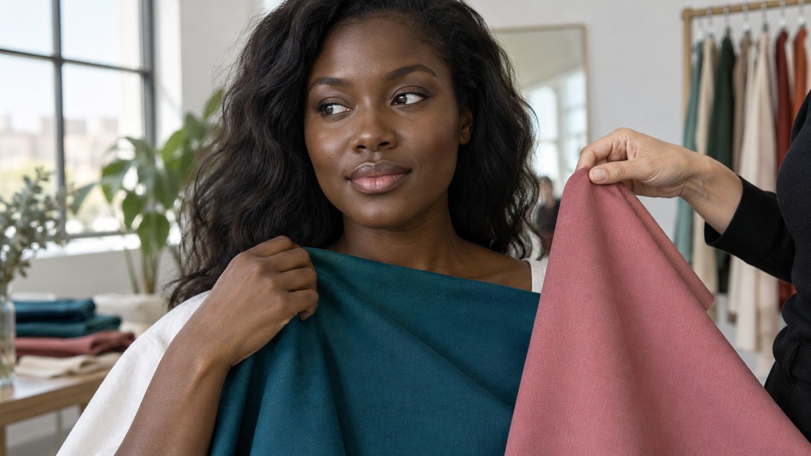
Personal color analysis often has its most visible application at the neckline. Shirts, knits, scarves and collars sit close to the face, so changing one can alter the impression of an entire outfit. This is a manageable starting point if most of your existing wardrobe is black, gray or another neutral you intend to keep.
Select two or three colors you already enjoy wearing. A soft blue, berry or muted green can provide variety without demanding a new pair of trousers for each top. Hold each against both working neutrals. If a color combines with only one, decide whether that limitation is acceptable before treating it as a core wardrobe piece.
Area changes intensity. A clear red may feel too strong in a high-neck blouse but comfortable as a narrow scarf, a small print or a layer visible through an open jacket. A pale color can also be moderated with a deeper frame around it. Try those arrangements before deciding a particular shade cannot work for the office.
If scarves are inconvenient, use a collar or a simple knit instead. Jewelry can offer a small color echo, but it should fit the job's practical requirements. There is no need for an accessory that catches on equipment, distracts you throughout the day or feels unlike your style just because it matches a swatch.
Combine jackets, shirts and accessories
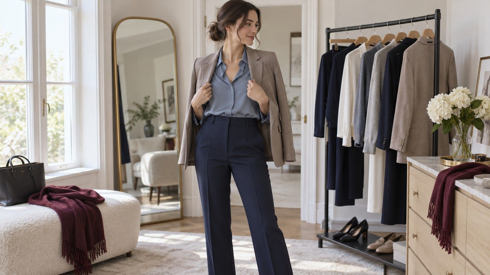
Build outfits from actual garments, not isolated colors. Put the jacket over the shirt and look at the neckline, sleeve and hem together. A jacket lining, a visible button or a striped shirt may add another color to the combination. Sometimes that small detail connects two pieces; sometimes it makes an already busy outfit harder to use.
For a simple starting arrangement, keep two larger pieces quiet and let one piece carry the color. Charcoal trousers with a gray jacket can support a blue shirt; navy trousers and a navy knit can leave room for a patterned scarf. This is a convenience, not a limit. Once the combinations are familiar, you can choose more contrast deliberately.
Prints are useful when they repeat colors you own, but inspect their scale and background. A print containing both brown and blue may connect a brown cardigan with navy trousers. If its background is a white you dislike near your face, a tiny trace of your preferred blue may not rescue it. Judge the whole piece from a normal distance.
Texture can help separate similar neutrals. A soft knit and a smooth trouser fabric may look deliberate in related grays, while two slightly different shiny fabrics can seem accidentally mismatched. Keep comfort and maintenance in the decision too. A color that works beautifully in a blouse you avoid ironing will not simplify a busy morning.
Make a small photograph collection of complete outfits, including shoes. Use an ordinary mirror view in steady light and label the occasions: everyday desk work, client meeting, warm day or video presentation. The photographs are dressing references rather than evidence of a perfect seasonal match. Their value is showing a combination you can repeat.
Buy only what fills a gap
Audit a normal working week before making a shopping list. Set out five outfits, allowing for the way you repeat trousers or layers. Check which tops will actually be clean and ready when needed. A wardrobe with many coordinated pieces can still fail if all the practical shirts are in the wash by Thursday.
Identify the bottleneck. You may have several good tops but no layer that works over their sleeves, or two useful trousers with only one suitable pair of shoes. A missing color is not automatically the most urgent gap. Fit, weather, laundering and dress code can be the reason an otherwise coordinated outfit stays on the hanger.
Give each proposed purchase at least three existing combinations when possible. A shirt that works with both neutral bottoms and your regular jacket earns its place quickly. A special jacket that needs new trousers, shoes and a bag is a larger project. It may still be worthwhile for a real event, but it should be budgeted as a complete outfit.
Carry a physical fabric reference or wear the garment you need to match. Phone screens, store lighting and product photographs can shift colors, particularly subtle neutrals. If you cannot compare in person, check the return terms and try the new item with your clothes in daylight while it is still eligible to return. Keep tags attached during that test.
Replace pieces gradually. A sound pair of black trousers can remain useful even if your new palette favors softer colors. Add a preferred shirt near the face, use a jacket to bridge the contrast and judge the result. Your wardrobe needs to support your work and budget as well as your visual preferences.
After a few weeks, review what you wore repeatedly. Keep the two neutral bases and the accent colors that earned regular use; leave space for a color you simply enjoy. A practical office palette is recognizable in the outfits hanging ready for Monday, not in the number of perfectly labeled swatches you own.