You try a color analysis filter in daylight and get one season, then open it in the kitchen and get another. Nothing about your wardrobe has changed, yet the labels seem incompatible. Before treating either answer as a verdict, separate the face being recorded from the colored frame being displayed. A filter can help you notice preferences, but it also changes the conditions under which you judge them.
What a filter actually changes
Some filters place colored panels around a live camera view. Others apply virtual drapes, analyze a saved photograph or combine a palette overlay with skin smoothing. These are different tasks. A frame can make a face appear warmer or cooler by comparison without changing the face pixels at all. A beauty effect may alter those pixels directly, hiding the very differences you hoped to compare.
Surround contrast explains why a neutral-looking patch can seem different against two backgrounds. The same effect influences how you read a face inside a large ring of color. A bright frame may make the center seem comparatively dull; a dark frame can make the center feel lighter. That visual response is worth noticing, but it is not the same as light reflecting from a real shirt onto your skin.
A filter may also assign a season based on selected image features. The exact method varies, and a confident animation does not reveal how the decision was made. Do not assume that a moving color wheel measures undertone, or that a season name has been independently checked. If no method is explained, use the output as a suggestion for further comparison.
Watch your face while changing the filter setting. If the lips, eyes or skin texture change alongside the background, the tool is doing more than presenting colors. Turn off enhancements where possible. If you cannot separate them, save the result as a styling experiment and avoid using it to settle a close warm-versus-cool judgment.
Keep exposure steady while the colors move
Set up facing a window in indirect daylight, with room lamps switched off. Keep the phone still and avoid a colorful wall immediately beside you. Strong sunshine, mixed lighting and a screen illuminating your face at night create extra variables. The aim is an ordinary, readable picture in which both sides of your face have similar illumination.
Camera processing can change as the frame changes. When a large pale panel appears, automatic exposure may respond differently than it does to a dark panel. White balance may shift too. That means you can end up comparing two differently processed faces rather than one face against two colors. If your camera allows exposure and white-balance control, keep them stable; the available controls vary by device and app.
A saved, unfiltered photo can be easier to compare than a live feed because your pose and expression remain fixed. Choose a file taken in suitable light with no color adjustment, portrait retouching or social-media effect. Use the same file for every overlay. A color analysis test photo is less useful when one version has a tan filter and another has had its shadows brightened.
Take a baseline screenshot before making comparisons and another after switching palettes. Check whether the face itself changed in brightness or hue. If it did, repeat with a static image or a different setup. A tiny change is hard to avoid on consumer equipment; a visibly warmer face in one frame is a reason to distrust that particular comparison.
Compare colors before comparing season names
Hide the labels if the tool allows it. A name such as bright spring can encourage you to notice energy and warmth, while a muted label can encourage you to see softness. Looking first and reading the classification afterward reduces that nudge. Write a plain observation: the clearer blue feels stronger than the face, or the softer green feels easier with the eyes and brows.
Compare one dimension at a time. Start with lighter versus deeper options that are otherwise reasonably similar. Then compare warm and cool versions, followed by clearer and more muted colors. A deep burgundy beside a pale peach may show an overall preference, but it cannot tell you whether depth, temperature or saturation caused it.
| What you notice | Useful next comparison | Reason to pause |
|---|---|---|
| Light shades seem to disappear | A medium-depth version of a similar hue | The camera brightens your face between frames |
| Bright colors dominate | A softer version at similar depth | The overlay also smooths or recolors skin |
| Warm and cool feel equally plausible | Matched physical fabrics in steady light | You are comparing very different textures or depths |
Keep neighboring options in play. You may like a cool rose from one palette and a softened blue from another. That does not mean you failed the test. Seasonal groups package many colors together, while your immediate decision may concern just one sweater. Record the shade characteristics you can repeat rather than forcing a complete identity from one screen session.
Take a break after a few rounds. Staring at saturated panels can make the next color feel different simply because you have been looking at the previous one. Return to a plain, neutral background and then repeat the two most useful options. If the preference disappears, label it uncertain and move on.
Check the screen preference against physical fabric
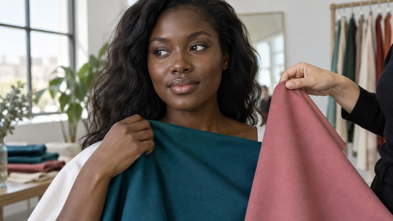
Find a few clothes or scarves that roughly represent your leading options. They need not match the digital palette perfectly. Start with something you already wear comfortably, then compare it with a contrasting candidate under the same light. Hold the fabric close enough to frame the face, with the rest of the outfit covered if it is distracting.
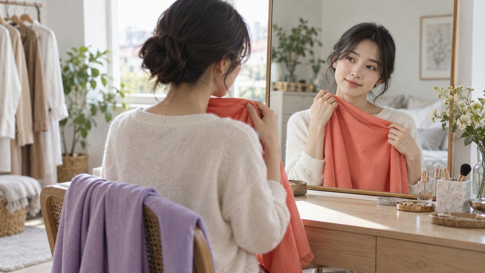
Look in a mirror before relying on a photograph. With actual cloth, you see texture, folds, reflectivity and reflected light together. Those features are part of wearing a color. A matte navy knit and a glossy navy blouse can create different effects even if an app places both in the same color family.
A phone display cannot promise an exact shopping match. Screen settings, brightness, ambient light and the fabric's finish all influence what you see. Treat a saved swatch as a direction such as softened blue-green or cool medium pink, not a specification that a store item must reproduce pixel for pixel. Place the garment near your face before deciding.
If the virtual drape wins but the nearest physical fabric does not, examine the mismatch. The cloth may be brighter, warmer or shinier than the screen example. Repeat with another sample before rejecting a whole palette. Conversely, if an old favorite keeps working in real life despite receiving an unfavorable label, that is useful evidence about the limits of the filter.
Save a comparison you can actually use
Keep a small set of images rather than dozens of near-duplicates. Save the original photograph, two leading overlays and a note about the conditions: indirect window light, no makeup or the makeup used, hair visible or covered. Name the colors in everyday language so you can recognize them later without reopening the app.
For each leading option, add one wardrobe observation. Perhaps a softened teal shirt works with your existing gray jacket, or a very pale pink needs more contrast around the collar. This connects the screen experiment to an outfit decision. It also prevents a changing season badge from erasing what you already learned from wearing the clothes.
Keep technical comparisons on one display where possible. Sending a screenshot to another phone can change its appearance through display settings and viewing conditions. Another person's opinion may still help, but ask them to compare the same two choices on the same screen before discussing the label. Agreement is easier to interpret when the visual conditions match.
Before uploading a face photograph, check how the service explains storage, sharing and deletion, especially if the app is unfamiliar. A cropped image can still identify you. If those terms are unclear, you can do the fabric comparisons without uploading anything. There is no need to trade a picture for a season name merely because the filter makes the process entertaining.
Use the saved set during your next small clothing decision. Look for a similar color family, compare the fabric in person and check whether it works with what you own. A filter has done a useful job when it helps you describe and test a preference. It does not need to deliver the same label in every room to contribute one good idea.